


Split/Pay
Mobile App for sharing bills and payments

Mission: Create a simple, user-centric mobile app that allows users to split bills or payments without the usual stress of financial coordination
Impact: 92% positive feedback on initial testing round of prototype
Introduction
The stakeholders presented me with a PRD for this project that outlined what seemed like a straightforward task; make a payment sharing app that eases the stress of shared financial responsibilities.
The market has no shortage of mobile pay sharing apps, but each comes with its own quirks. Some integrated systems, like Zelle, feel overly formal and severe in their approach. Others, like Venmo, are quick and easy, but sacrifice advanced features like groups and scheduling to achieve it. Still others, like Splitwise, include more advanced features, but lack the actual financial integration to be an all-in-one solution.
Enter Split/Pay, the app that combines a friendly design stance and attitude with straightforward user flows and actual integration of financial features. The new one-stop shop when there’s a bill to share!

Research
PRD Response Outline and Initial Notes
After reviewing the stakeholder PRD, I wanted to quickly outline my approach to this project to give a better sense of the branding approach, design priorities, and prevailing project goals. The outcome of this project seemed keenly aimed at a feeling; making budgeting apps feel friendlier and more approachable. I wanted to nail down some key tenets right at the top of my work so that they’d function as pillars to reference whenever a decision had to be made.
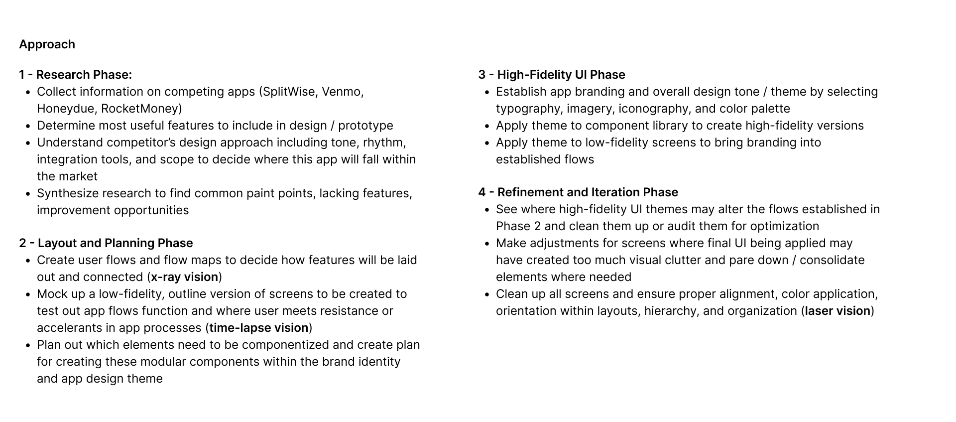
PLanned Approach
Next, I wasted no time and laid out my approach and timeline in phases so that I could stay organized throughout this project’s very compacted timeline. For v1 of testing, I had about 3 weeks to get the prototype version together and in front of test users. Keeping that in mind, I wanted to keep my workflow tight and organized so as not to miss any essential parts of the process.
(Quick) Competitor Analysis
I obviously didn’t want to enter a market I wasn’t an expert in blind, so I dedicated a day to testing out competing apps in-depth to see where they shone or could be improved. I also dove deep into user reviews to get a better sense of the largest complaints for each kind of app. I found that each of the biggest apps in this space had key issues to users:
Venmo: clean and easy to use, but lacking advanced features
SplitWise: feature-packed, but lacking true financial system integration
At this point I knew I needed to utilize the same kind of clean UI that made Venmo a hit and make sure financial integration was tight without sacrificing features that would make those features truly useful.

Lo-Fi
I laid out all the necessary steps for the tasks based on what the PRD had outlined as top priority. For each step I reminded myself of the core goals:
keep the tone friendly and simple
make the UI easy and intuitive to use
integrate pro features seamlessly
After putting together the lofi prototype, I wanted to get the screens in front of users as quickly as possible. I conducted an initial round of testing and held critique with some other designers, which resulted in some very valuable and actionable feedback. I notated those changes here:
I applied this feedback to my frames, began converting them to high-fidelity versions with full UI and textures, and laid out the initial prototype version of the app to present to the founders and have prepared for the next round of testing.
Prototype
Takeaways
1. The Tone design sets deeply impacts user perception.
2. Familiarty through design patterns make users feel at home faster.
3. Even High-Stress tasks like sharing finances can be made fun and friendly.
IMPACT
92% positive feedback in first user test
the most common feedback keywords were ‘familiar’ and ‘simple’
users had almost universally positive views of the chosen branding and color story
v1 of Split/PAY completed 9 weeks ahead of schedule
the founders had allotted 12 weeks for what I was able to finish in 3 weeks
they expressed excitement about the direction of the brand and feel
they were confident that what I handed off would allow future full-time designers to resume work quickly